Use case

Build a live dashboard from the tools your team already uses.

Ask your AI, inspect the result, then keep every chart refreshable and ready to share.

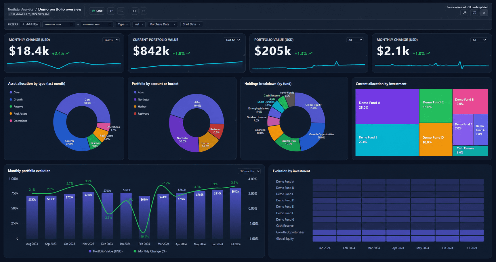
Dashboard overview

See the whole result first. Explore each chart when you need it.

Chart details

Tune every chart without rebuilding the dashboard.

Open a chart topic to see what data it needs, when to use it, and how to personalize it with a simple request.

01 / Chart guide

KPI card

Lead a dashboard with one headline metric and its recent historical movement.

Personalized by prompt

Real saved dashboard sample

Revenue

Glow

Revenue

$156.0

+9.9%

Sample dataset from the saved dashboard

monthrevenue
2026-01118,000
2026-02109,000
2026-03126,000
2026-04140,000

What this chart needs

  • Categories or dates: ordered time column for the trend line
  • Values: number headline column

Example user prompt

Show a KPI card for monthly revenue with its recent trend and change.

Try this prompt

Create a Glow KPI card for monthly revenue. Show currency, the historical sparkline, latest value mode, and percent change vs the prior month.

Personalization options

Number format · Decimal places

Changes axes, labels, tooltips, headline values, and table numeric cells where the template uses the shared formatter.

Try asking: Format this chart as currency with 2 decimals.

Show currency · Currency symbol

Adds the chosen currency prefix to formatted values without changing the underlying data.

Try asking: Show values in Brazilian reais using R$.

Display units · Unit labels

Scales value labels such as 1254000 to 1.3, 1.3M, or 1.3 million while keeping raw data intact.

Try asking: Show value labels in millions with the short M suffix.

Title alignment · Chart title visibility

Moves the card title or hides the title chrome when the chart needs to sit inside a dense dashboard.

Try asking: Center the title and hide it on the KPI cards.

Comparison label · Performance color

Explains the comparison period and can color the headline when a threshold matters.

Try asking: Use comparison label vs prior month and color the value green.

Trend line · Headline calculation

Shows the historical line at the bottom and chooses whether the headline is the latest point or sum of the visible window.

Try asking: Show the small KPI trend line and use the most recent value.

Value alignment · Value size · Visible time range

Tunes KPI density and the historical window used by the trend line.

Try asking: Left-align the headline value, make it 110%, and show the last 6 months.

02 / Chart guide

Bar chart

Compare one measure across categories, such as sales by category or tickets by priority.

Personalized by prompt

Real saved dashboard sample

Sales by Category

Glow

Sample dataset from the saved dashboard

categorysales
Electronics45,200
Clothing32,100
Home & Garden28,900
Sports19,800

What this chart needs

  • Categories or dates: category column
  • Values: number measure column

Example user prompt

Show a bar chart of sales by category.

Try this prompt

Create a Glow bar chart of sales by category. Sort descending, show currency labels, use open bar borders, and rotate crowded labels.

Personalization options

Number format · Decimal places

Changes axes, labels, tooltips, headline values, and table numeric cells where the template uses the shared formatter.

Try asking: Format this chart as currency with 2 decimals.

Show currency · Currency symbol

Adds the chosen currency prefix to formatted values without changing the underlying data.

Try asking: Show values in Brazilian reais using R$.

Display units · Unit labels

Scales value labels such as 1254000 to 1.3, 1.3M, or 1.3 million while keeping raw data intact.

Try asking: Show value labels in millions with the short M suffix.

Title alignment · Chart title visibility

Moves the card title or hides the title chrome when the chart needs to sit inside a dense dashboard.

Try asking: Center the title and hide it on the KPI cards.

Grid lines · Axis label color

Shows or hides the reference grid and changes axis tick color for darker or lighter dashboard canvases.

Try asking: Hide the grid and make axis labels cyan.

Value labels · Label size

Prints values directly on bars, lines, or points, with label size tuned for dense charts.

Try asking: Turn on value labels and make them 12px.

Label angle · Visible time range

Rotates crowded x-axis labels or focuses long time series on the most recent window.

Try asking: Rotate labels 45 degrees and show only the last 12 months.

Minimum value · Maximum value

Pins the value axis so charts can share a consistent scale across a dashboard.

Try asking: Pin the y-axis from 0 to 100000.

Sort direction · Scrolling for long lists

Ranks categories high-to-low or low-to-high and lets long lists scroll instead of squeezing bars.

Try asking: Sort bars descending and make the chart scrollable.

Bar outlines · Outline style · Bar fade direction

Controls the Glow bar outline and whether the fade is strongest at the top or baseline.

Try asking: Use open bar borders and invert the Glow fade.

03 / Chart guide

Horizontal bar

Rank long category names where horizontal labels need room.

Personalized by prompt

Real saved dashboard sample

Sales by Category

Glow

Sample dataset from the saved dashboard

categorysales
Electronics45,200
Home & Garden38,900
Clothing32,100
Sports & Outdoors24,800

What this chart needs

  • Categories or dates: category column
  • Values: number measure column

Example user prompt

Show a horizontal bar chart ranking categories by sales.

Try this prompt

Create a Glow horizontal bar chart of sales by category. Sort descending, show value labels, and make long lists scroll vertically.

Personalization options

Number format · Decimal places

Changes axes, labels, tooltips, headline values, and table numeric cells where the template uses the shared formatter.

Try asking: Format this chart as currency with 2 decimals.

Show currency · Currency symbol

Adds the chosen currency prefix to formatted values without changing the underlying data.

Try asking: Show values in Brazilian reais using R$.

Display units · Unit labels

Scales value labels such as 1254000 to 1.3, 1.3M, or 1.3 million while keeping raw data intact.

Try asking: Show value labels in millions with the short M suffix.

Title alignment · Chart title visibility

Moves the card title or hides the title chrome when the chart needs to sit inside a dense dashboard.

Try asking: Center the title and hide it on the KPI cards.

Grid lines · Axis label color

Shows or hides the reference grid and changes axis tick color for darker or lighter dashboard canvases.

Try asking: Hide the grid and make axis labels cyan.

Value labels · Label size

Prints values directly on bars, lines, or points, with label size tuned for dense charts.

Try asking: Turn on value labels and make them 12px.

Label angle · Visible time range

Rotates crowded x-axis labels or focuses long time series on the most recent window.

Try asking: Rotate labels 45 degrees and show only the last 12 months.

Minimum value · Maximum value

Pins the value axis so charts can share a consistent scale across a dashboard.

Try asking: Pin the y-axis from 0 to 100000.

Sort direction · Scrolling for long lists

Ranks categories high-to-low or low-to-high and lets long lists scroll instead of squeezing bars.

Try asking: Sort bars descending and make the chart scrollable.

Bar outlines · Outline style · Bar fade direction

Controls the Glow bar outline and whether the fade is strongest at the top or baseline.

Try asking: Use open bar borders and invert the Glow fade.

04 / Chart guide

Stacked bar

Compare totals and their parts, such as quarterly revenue split by product line.

Personalized by prompt

Real saved dashboard sample

Revenue by Region & Product

Glow

Sample dataset from the saved dashboard

quarterelectronicsclothinghomesports
Q128,00018,00012,0008,000
Q232,00022,00015,00011,000
Q335,00019,00018,00013,000
Q442,00028,00022,00016,000

What this chart needs

  • Categories or dates: category or period column
  • Values: one or more number series fields

Example user prompt

Show a stacked bar chart of revenue by region and product.

Try this prompt

Create a Glow stacked bar chart by quarter with product lines stacked. Show the legend and switch to 100% mode when I ask for share.

Personalization options

Number format · Decimal places

Changes axes, labels, tooltips, headline values, and table numeric cells where the template uses the shared formatter.

Try asking: Format this chart as currency with 2 decimals.

Show currency · Currency symbol

Adds the chosen currency prefix to formatted values without changing the underlying data.

Try asking: Show values in Brazilian reais using R$.

Display units · Unit labels

Scales value labels such as 1254000 to 1.3, 1.3M, or 1.3 million while keeping raw data intact.

Try asking: Show value labels in millions with the short M suffix.

Title alignment · Chart title visibility

Moves the card title or hides the title chrome when the chart needs to sit inside a dense dashboard.

Try asking: Center the title and hide it on the KPI cards.

Grid lines · Axis label color

Shows or hides the reference grid and changes axis tick color for darker or lighter dashboard canvases.

Try asking: Hide the grid and make axis labels cyan.

Value labels · Label size

Prints values directly on bars, lines, or points, with label size tuned for dense charts.

Try asking: Turn on value labels and make them 12px.

Label angle · Visible time range

Rotates crowded x-axis labels or focuses long time series on the most recent window.

Try asking: Rotate labels 45 degrees and show only the last 12 months.

Minimum value · Maximum value

Pins the value axis so charts can share a consistent scale across a dashboard.

Try asking: Pin the y-axis from 0 to 100000.

Sort direction · Scrolling for long lists

Ranks categories high-to-low or low-to-high and lets long lists scroll instead of squeezing bars.

Try asking: Sort bars descending and make the chart scrollable.

Bar outlines · Outline style · Bar fade direction

Controls the Glow bar outline and whether the fade is strongest at the top or baseline.

Try asking: Use open bar borders and invert the Glow fade.

Stacking style

Normal mode shows absolute totals; 100% mode compares percentage composition per category.

Try asking: Switch this stacked bar to 100% share mode.

Series labels

Renames the legend from raw column names to business labels.

Try asking: Rename the series to Electronics, Clothing, Home, and Sports.

05 / Chart guide

Grouped bar

Compare two to four related measures side by side for every category.

Personalized by prompt

Real saved dashboard sample

Sales vs Target by Region

Glow

Sample dataset from the saved dashboard

regionsalestarget
North45,00042,000
South38,00040,000
East52,00048,000
West41,00045,000

What this chart needs

  • Categories or dates: category column
  • Values: one or more number series fields

Example user prompt

Show sales versus target by region as grouped bars.

Try this prompt

Create a Glow grouped bar chart for sales and target by region. Show the legend, use currency, and keep labels horizontal.

Personalization options

Number format · Decimal places

Changes axes, labels, tooltips, headline values, and table numeric cells where the template uses the shared formatter.

Try asking: Format this chart as currency with 2 decimals.

Show currency · Currency symbol

Adds the chosen currency prefix to formatted values without changing the underlying data.

Try asking: Show values in Brazilian reais using R$.

Display units · Unit labels

Scales value labels such as 1254000 to 1.3, 1.3M, or 1.3 million while keeping raw data intact.

Try asking: Show value labels in millions with the short M suffix.

Title alignment · Chart title visibility

Moves the card title or hides the title chrome when the chart needs to sit inside a dense dashboard.

Try asking: Center the title and hide it on the KPI cards.

Grid lines · Axis label color

Shows or hides the reference grid and changes axis tick color for darker or lighter dashboard canvases.

Try asking: Hide the grid and make axis labels cyan.

Value labels · Label size

Prints values directly on bars, lines, or points, with label size tuned for dense charts.

Try asking: Turn on value labels and make them 12px.

Label angle · Visible time range

Rotates crowded x-axis labels or focuses long time series on the most recent window.

Try asking: Rotate labels 45 degrees and show only the last 12 months.

Minimum value · Maximum value

Pins the value axis so charts can share a consistent scale across a dashboard.

Try asking: Pin the y-axis from 0 to 100000.

Sort direction · Scrolling for long lists

Ranks categories high-to-low or low-to-high and lets long lists scroll instead of squeezing bars.

Try asking: Sort bars descending and make the chart scrollable.

Bar outlines · Outline style · Bar fade direction

Controls the Glow bar outline and whether the fade is strongest at the top or baseline.

Try asking: Use open bar borders and invert the Glow fade.

Series labels

Turns raw keys like sales and target into readable legend labels.

Try asking: Rename the series to Actual sales and Target.

06 / Chart guide

Combo (bar + line)

Pair a level metric with a rate or change metric, such as revenue bars plus margin line.

Personalized by prompt

Real saved dashboard sample

Revenue & Profit Margin

Glow

Sample dataset from the saved dashboard

monthrevenuemargin
Jan42,00018
Feb38,00015
Mar51,00022
Apr47,00020

What this chart needs

  • Categories or dates: time or category column
  • Values: one value for bars and one for the line

Example user prompt

Show revenue as bars and margin as a line by month.

Try this prompt

Create a Glow combo chart with revenue as bars and margin as the line. Format bars as currency and the line as percent.

Personalization options

Number format · Decimal places

Changes axes, labels, tooltips, headline values, and table numeric cells where the template uses the shared formatter.

Try asking: Format this chart as currency with 2 decimals.

Show currency · Currency symbol

Adds the chosen currency prefix to formatted values without changing the underlying data.

Try asking: Show values in Brazilian reais using R$.

Display units · Unit labels

Scales value labels such as 1254000 to 1.3, 1.3M, or 1.3 million while keeping raw data intact.

Try asking: Show value labels in millions with the short M suffix.

Title alignment · Chart title visibility

Moves the card title or hides the title chrome when the chart needs to sit inside a dense dashboard.

Try asking: Center the title and hide it on the KPI cards.

Grid lines · Axis label color

Shows or hides the reference grid and changes axis tick color for darker or lighter dashboard canvases.

Try asking: Hide the grid and make axis labels cyan.

Value labels · Label size

Prints values directly on bars, lines, or points, with label size tuned for dense charts.

Try asking: Turn on value labels and make them 12px.

Label angle · Visible time range

Rotates crowded x-axis labels or focuses long time series on the most recent window.

Try asking: Rotate labels 45 degrees and show only the last 12 months.

Minimum value · Maximum value

Pins the value axis so charts can share a consistent scale across a dashboard.

Try asking: Pin the y-axis from 0 to 100000.

Line number format · Line decimal places

Formats the line and right axis independently from the bars and left axis.

Try asking: Format the right axis as percent with one decimal.

Line display units

Scales the line labels separately from the bar labels when the two series use different magnitudes.

Try asking: Show bar labels in millions and line labels as percent.

Line minimum · Line maximum

Pins the right axis so percentage movement does not auto-zoom too tightly.

Try asking: Pin the right axis from 0 to 70 percent.

07 / Chart guide

Line chart

Show trend, momentum, and target comparison over time.

Personalized by prompt

Real saved dashboard sample

Revenue vs Target

Glow

Sample dataset from the saved dashboard

monthrevenuetarget
Jan42,00040,000
Feb38,00041,000
Mar51,00042,000
Apr47,00043,000

What this chart needs

  • Categories or dates: ordered time or category column
  • Values: one or more number series fields

Example user prompt

Show revenue versus target as a line chart.

Try this prompt

Create a Glow line chart for revenue versus target. Use smooth curves, area fill, value labels, and show percent change.

Personalization options

Number format · Decimal places

Changes axes, labels, tooltips, headline values, and table numeric cells where the template uses the shared formatter.

Try asking: Format this chart as currency with 2 decimals.

Show currency · Currency symbol

Adds the chosen currency prefix to formatted values without changing the underlying data.

Try asking: Show values in Brazilian reais using R$.

Display units · Unit labels

Scales value labels such as 1254000 to 1.3, 1.3M, or 1.3 million while keeping raw data intact.

Try asking: Show value labels in millions with the short M suffix.

Title alignment · Chart title visibility

Moves the card title or hides the title chrome when the chart needs to sit inside a dense dashboard.

Try asking: Center the title and hide it on the KPI cards.

Grid lines · Axis label color

Shows or hides the reference grid and changes axis tick color for darker or lighter dashboard canvases.

Try asking: Hide the grid and make axis labels cyan.

Value labels · Label size

Prints values directly on bars, lines, or points, with label size tuned for dense charts.

Try asking: Turn on value labels and make them 12px.

Label angle · Visible time range

Rotates crowded x-axis labels or focuses long time series on the most recent window.

Try asking: Rotate labels 45 degrees and show only the last 12 months.

Minimum value · Maximum value

Pins the value axis so charts can share a consistent scale across a dashboard.

Try asking: Pin the y-axis from 0 to 100000.

Point markers · Area shading · Line style

Controls point markers, soft fill under the line, and whether the line is smoothed or stepped.

Try asking: Use a smooth line with area fill and hide the dots.

Percent change · Series labels

Adds percent-change callouts and business-friendly legend names.

Try asking: Show percent change and rename the series to Revenue and Target.

08 / Chart guide

Dual-axis

Compare two metrics with different units, such as revenue and orders.

Personalized by prompt

Real saved dashboard sample

Revenue & Orders

Glow

Sample dataset from the saved dashboard

monthrevenueorders
Jan42,000320
Feb38,000280
Mar51,000410
Apr47,000350

What this chart needs

  • Categories or dates: shared axis column
  • Values: two number series fields

Example user prompt

Show revenue and orders on a dual-axis chart.

Try this prompt

Create a Glow dual-axis chart with revenue and orders by month. Use currency for revenue and compact numbers for orders.

Personalization options

Number format · Decimal places

Changes axes, labels, tooltips, headline values, and table numeric cells where the template uses the shared formatter.

Try asking: Format this chart as currency with 2 decimals.

Show currency · Currency symbol

Adds the chosen currency prefix to formatted values without changing the underlying data.

Try asking: Show values in Brazilian reais using R$.

Display units · Unit labels

Scales value labels such as 1254000 to 1.3, 1.3M, or 1.3 million while keeping raw data intact.

Try asking: Show value labels in millions with the short M suffix.

Title alignment · Chart title visibility

Moves the card title or hides the title chrome when the chart needs to sit inside a dense dashboard.

Try asking: Center the title and hide it on the KPI cards.

Grid lines · Axis label color

Shows or hides the reference grid and changes axis tick color for darker or lighter dashboard canvases.

Try asking: Hide the grid and make axis labels cyan.

Value labels · Label size

Prints values directly on bars, lines, or points, with label size tuned for dense charts.

Try asking: Turn on value labels and make them 12px.

Label angle · Visible time range

Rotates crowded x-axis labels or focuses long time series on the most recent window.

Try asking: Rotate labels 45 degrees and show only the last 12 months.

Minimum value · Maximum value

Pins the value axis so charts can share a consistent scale across a dashboard.

Try asking: Pin the y-axis from 0 to 100000.

Series labels

Makes each axis and legend readable when source columns are terse.

Try asking: Rename the series to Revenue and Orders.

09 / Chart guide

Donut chart

Show part-of-whole distribution for a small number of categories.

Personalized by prompt

Real saved dashboard sample

Traffic Sources

Glow
Organic Search
Social Media
Direct
Email
Referral

Sample dataset from the saved dashboard

sourcevisitors
Organic Search4,500
Social Media2,800
Direct2,100
Email1,600

What this chart needs

  • Category labels: category column
  • Values: number value column

Example user prompt

Show traffic sources as a donut chart.

Try this prompt

Create a Glow donut chart for traffic sources. Show percent labels, put the legend on the right, and use Total as the center label.

Personalization options

Number format · Decimal places

Changes axes, labels, tooltips, headline values, and table numeric cells where the template uses the shared formatter.

Try asking: Format this chart as currency with 2 decimals.

Show currency · Currency symbol

Adds the chosen currency prefix to formatted values without changing the underlying data.

Try asking: Show values in Brazilian reais using R$.

Display units · Unit labels

Scales value labels such as 1254000 to 1.3, 1.3M, or 1.3 million while keeping raw data intact.

Try asking: Show value labels in millions with the short M suffix.

Title alignment · Chart title visibility

Moves the card title or hides the title chrome when the chart needs to sit inside a dense dashboard.

Try asking: Center the title and hide it on the KPI cards.

Slice labels

Controls whether slices show percentages, raw values, names, or no labels.

Try asking: Show percent and name labels on the donut slices.

Legend position · Center label · Legend

Moves the legend and adds a center label such as Total, Revenue, or Users.

Try asking: Move the legend to the bottom and set the center label to Total.

10 / Chart guide

Text summary

Explain what changed, what to watch, or what action to take next beside the charts.

Personalized by prompt

Real saved dashboard sample

Analysis Summary

Glow

Revenue grew 12.5% this quarter, driven by strong Electronics and Clothing performance. - Organic search remains the top traffic source at 38% - Conversion rate dipped slightly to 3.24% - Average order value increased to $67.80 (+5.2%)

Sample dataset from the saved dashboard

text
Revenue grew **12.5%** this quarter, driven by strong Electronics and Clothing performance. - **Organic search** remains the top traffic source at 38% - Conversion rate dipped slightly to 3.24% - Average order value increased to $67.80 (+5.2%)

What this chart needs

  • Written summary: markdown-like summary text

Example user prompt

Add a text summary explaining the sales dashboard.

Try this prompt

Create a text summary card with the top three dashboard takeaways and next actions.

Personalization options

Summary text

Updates the written analysis without changing any chart data.

Try asking: Rewrite the summary for an executive audience.

Title alignment · Chart title visibility

Moves the card title or hides the title chrome when the chart needs to sit inside a dense dashboard.

Try asking: Center the title and hide it on the KPI cards.

11 / Chart guide

Gantt chart

Show project phases, owners, or tasks across a timeline.

Personalized by prompt

Real saved dashboard sample

Product Launch Timeline

Glow

Sample dataset from the saved dashboard

taskstartendphase
Research & Discovery2026-01-062026-01-31Discovery
UX Design2026-01-202026-02-28Design
Visual Design2026-02-152026-03-15Design
Backend API2026-02-012026-04-10Build

What this chart needs

  • Task names: task label
  • Start date: start date or number
  • End date: end date or number
  • Optional color group: phase or owner

Example user prompt

Show a Gantt chart for the product launch timeline.

Try this prompt

Create a Glow Gantt chart for launch tasks. Use phase as the category color and task names on the y-axis.

Personalization options

Title alignment · Chart title visibility

Moves the card title or hides the title chrome when the chart needs to sit inside a dense dashboard.

Try asking: Center the title and hide it on the KPI cards.

Task names · Start date · End key

Maps the timeline labels and start/end boundaries to the correct source columns.

Try asking: Use task, start, and end as the Gantt fields.

Color grouping · Axis label color

Colors bars by phase or owner and adjusts axis label contrast.

Try asking: Color tasks by phase and make axis labels cyan.

12 / Chart guide

Area chart

Emphasize magnitude in a single trend, such as monthly revenue.

Personalized by prompt

Real saved dashboard sample

Monthly Revenue

Glow

Sample dataset from the saved dashboard

monthrevenue
Jan42,000
Feb45,500
Mar51,200
Apr49,800

What this chart needs

  • Categories or dates: ordered axis column
  • Values: number measure column

Example user prompt

Show monthly revenue as an area chart.

Try this prompt

Create a Glow area chart for monthly revenue. Use smooth curves, currency, and keep the grid visible.

Personalization options

Number format · Decimal places

Changes axes, labels, tooltips, headline values, and table numeric cells where the template uses the shared formatter.

Try asking: Format this chart as currency with 2 decimals.

Show currency · Currency symbol

Adds the chosen currency prefix to formatted values without changing the underlying data.

Try asking: Show values in Brazilian reais using R$.

Display units · Unit labels

Scales value labels such as 1254000 to 1.3, 1.3M, or 1.3 million while keeping raw data intact.

Try asking: Show value labels in millions with the short M suffix.

Title alignment · Chart title visibility

Moves the card title or hides the title chrome when the chart needs to sit inside a dense dashboard.

Try asking: Center the title and hide it on the KPI cards.

Grid lines · Axis label color

Shows or hides the reference grid and changes axis tick color for darker or lighter dashboard canvases.

Try asking: Hide the grid and make axis labels cyan.

Value labels · Label size

Prints values directly on bars, lines, or points, with label size tuned for dense charts.

Try asking: Turn on value labels and make them 12px.

Label angle · Visible time range

Rotates crowded x-axis labels or focuses long time series on the most recent window.

Try asking: Rotate labels 45 degrees and show only the last 12 months.

Minimum value · Maximum value

Pins the value axis so charts can share a consistent scale across a dashboard.

Try asking: Pin the y-axis from 0 to 100000.

Line style · Series label

Controls the area edge and legend name for the filled trend.

Try asking: Use a smooth curve and call the series Revenue.

13 / Chart guide

Overlapping area

Compare two or three trends where overlap is meaningful.

Personalized by prompt

Real saved dashboard sample

Website Traffic by Source

Glow

Sample dataset from the saved dashboard

weekorganicpaidsocial
W14,2002,8001,900
W24,5003,1002,200
W34,1003,4002,600
W44,8003,2003,100

What this chart needs

  • Categories or dates: ordered axis column
  • Values: one or more number series fields

Example user prompt

Show website traffic by source as overlapping areas.

Try this prompt

Create a Glow overlapping area chart for organic, paid, and social traffic. Use smooth curves and show the legend.

Personalization options

Number format · Decimal places

Changes axes, labels, tooltips, headline values, and table numeric cells where the template uses the shared formatter.

Try asking: Format this chart as currency with 2 decimals.

Show currency · Currency symbol

Adds the chosen currency prefix to formatted values without changing the underlying data.

Try asking: Show values in Brazilian reais using R$.

Display units · Unit labels

Scales value labels such as 1254000 to 1.3, 1.3M, or 1.3 million while keeping raw data intact.

Try asking: Show value labels in millions with the short M suffix.

Title alignment · Chart title visibility

Moves the card title or hides the title chrome when the chart needs to sit inside a dense dashboard.

Try asking: Center the title and hide it on the KPI cards.

Grid lines · Axis label color

Shows or hides the reference grid and changes axis tick color for darker or lighter dashboard canvases.

Try asking: Hide the grid and make axis labels cyan.

Value labels · Label size

Prints values directly on bars, lines, or points, with label size tuned for dense charts.

Try asking: Turn on value labels and make them 12px.

Label angle · Visible time range

Rotates crowded x-axis labels or focuses long time series on the most recent window.

Try asking: Rotate labels 45 degrees and show only the last 12 months.

Minimum value · Maximum value

Pins the value axis so charts can share a consistent scale across a dashboard.

Try asking: Pin the y-axis from 0 to 100000.

Legend · Series labels · Line style

Keeps layered series understandable and renames raw source columns.

Try asking: Show the legend and rename the series to Organic, Paid, and Social.

14 / Chart guide

Stacked area

Show total trend plus contribution from multiple segments.

Personalized by prompt

Real saved dashboard sample

Revenue by Product Line

Glow

Sample dataset from the saved dashboard

monthhardwaresoftwareservicestraining
Jan18,00012,0006,0002,500
Feb19,50013,5006,8002,700
Mar21,00015,2007,4003,100
Apr20,50016,8008,1003,400

What this chart needs

  • Categories or dates: ordered axis column
  • Values: one or more number series fields

Example user prompt

Show revenue by product line as a stacked area chart.

Try this prompt

Create a Glow stacked area chart for revenue by product line. Use currency, smooth curves, and readable series names.

Personalization options

Number format · Decimal places

Changes axes, labels, tooltips, headline values, and table numeric cells where the template uses the shared formatter.

Try asking: Format this chart as currency with 2 decimals.

Show currency · Currency symbol

Adds the chosen currency prefix to formatted values without changing the underlying data.

Try asking: Show values in Brazilian reais using R$.

Display units · Unit labels

Scales value labels such as 1254000 to 1.3, 1.3M, or 1.3 million while keeping raw data intact.

Try asking: Show value labels in millions with the short M suffix.

Title alignment · Chart title visibility

Moves the card title or hides the title chrome when the chart needs to sit inside a dense dashboard.

Try asking: Center the title and hide it on the KPI cards.

Grid lines · Axis label color

Shows or hides the reference grid and changes axis tick color for darker or lighter dashboard canvases.

Try asking: Hide the grid and make axis labels cyan.

Value labels · Label size

Prints values directly on bars, lines, or points, with label size tuned for dense charts.

Try asking: Turn on value labels and make them 12px.

Label angle · Visible time range

Rotates crowded x-axis labels or focuses long time series on the most recent window.

Try asking: Rotate labels 45 degrees and show only the last 12 months.

Minimum value · Maximum value

Pins the value axis so charts can share a consistent scale across a dashboard.

Try asking: Pin the y-axis from 0 to 100000.

Stacking style · Legend · Series labels

Switches between absolute totals and share comparison, while keeping segment names readable.

Try asking: Show the legend and rename the product line series.

15 / Chart guide

Streamgraph

Show shifting mix over time when the shape and flow are the story.

Personalized by prompt

Real saved dashboard sample

Sessions by Country

Glow

Sample dataset from the saved dashboard

dayUSUKDEBRJP
Mon4,2001,8001,5009001,100
Tue4,5002,1001,7001,2001,000
Wed5,1002,4001,9001,4001,300
Thu5,6002,6002,2001,7001,500

What this chart needs

  • Categories or dates: ordered axis column
  • Values: one or more number series fields

Example user prompt

Show sessions by country as a streamgraph.

Try this prompt

Create a Glow streamgraph of sessions by country. Use compact numbers, smooth curves, and show the legend.

Personalization options

Number format · Decimal places

Changes axes, labels, tooltips, headline values, and table numeric cells where the template uses the shared formatter.

Try asking: Format this chart as currency with 2 decimals.

Show currency · Currency symbol

Adds the chosen currency prefix to formatted values without changing the underlying data.

Try asking: Show values in Brazilian reais using R$.

Display units · Unit labels

Scales value labels such as 1254000 to 1.3, 1.3M, or 1.3 million while keeping raw data intact.

Try asking: Show value labels in millions with the short M suffix.

Title alignment · Chart title visibility

Moves the card title or hides the title chrome when the chart needs to sit inside a dense dashboard.

Try asking: Center the title and hide it on the KPI cards.

Grid lines · Axis label color

Shows or hides the reference grid and changes axis tick color for darker or lighter dashboard canvases.

Try asking: Hide the grid and make axis labels cyan.

Value labels · Label size

Prints values directly on bars, lines, or points, with label size tuned for dense charts.

Try asking: Turn on value labels and make them 12px.

Label angle · Visible time range

Rotates crowded x-axis labels or focuses long time series on the most recent window.

Try asking: Rotate labels 45 degrees and show only the last 12 months.

Minimum value · Maximum value

Pins the value axis so charts can share a consistent scale across a dashboard.

Try asking: Pin the y-axis from 0 to 100000.

Legend · Series labels · Line style

Keeps the flowing layers identifiable and adjusts the shape of the streams.

Try asking: Show the legend and use smooth curves.

16 / Chart guide

Ridgeline

Compare distributions across categories, such as daily active users by region.

Personalized by prompt

Real saved dashboard sample

Daily Active Users by Region

Glow
D1D4D7D10D13D16D19D20Central regionWest regionEast regionSouth regionNorth region

Sample dataset from the saved dashboard

dayNorthSouthEastWestCentral
D1320280190410150
D2380310220450180
D3450360280490220
D4520420340530280

What this chart needs

  • Categories or dates: shared axis column
  • Values: one or more series fields

Example user prompt

Show daily active users by region as a ridgeline chart.

Try this prompt

Create a Glow ridgeline chart for daily active users by region. Use compact numbers and readable region names.

Personalization options

Number format · Decimal places

Changes axes, labels, tooltips, headline values, and table numeric cells where the template uses the shared formatter.

Try asking: Format this chart as currency with 2 decimals.

Show currency · Currency symbol

Adds the chosen currency prefix to formatted values without changing the underlying data.

Try asking: Show values in Brazilian reais using R$.

Display units · Unit labels

Scales value labels such as 1254000 to 1.3, 1.3M, or 1.3 million while keeping raw data intact.

Try asking: Show value labels in millions with the short M suffix.

Title alignment · Chart title visibility

Moves the card title or hides the title chrome when the chart needs to sit inside a dense dashboard.

Try asking: Center the title and hide it on the KPI cards.

Categories or dates · Values · Series labels

Controls the shared x-axis and the stacked distribution rows.

Try asking: Use day as the x-axis and rename the region series.

17 / Chart guide

Scatter plot

Show relationship between two numeric measures, with optional bubble size.

Personalized by prompt

Real saved dashboard sample

Revenue vs. Transaction Count

Glow

Sample dataset from the saved dashboard

partnerrevenuetransactionsavgOrder
Acme Corp142,0003,20044.38
Bolt Payments98,0002,10046.67
ClearPay210,0004,80043.75
DataFlow67,0001,50044.67

What this chart needs

  • Horizontal value: number x measure
  • Vertical value: number y measure
  • optional sizeKey and categoryKey

Example user prompt

Show revenue versus transaction count as a scatter plot.

Try this prompt

Create a Glow scatter plot of transactions versus revenue. Size bubbles by average order and color by segment if available.

Personalization options

Number format · Decimal places

Changes axes, labels, tooltips, headline values, and table numeric cells where the template uses the shared formatter.

Try asking: Format this chart as currency with 2 decimals.

Show currency · Currency symbol

Adds the chosen currency prefix to formatted values without changing the underlying data.

Try asking: Show values in Brazilian reais using R$.

Display units · Unit labels

Scales value labels such as 1254000 to 1.3, 1.3M, or 1.3 million while keeping raw data intact.

Try asking: Show value labels in millions with the short M suffix.

Title alignment · Chart title visibility

Moves the card title or hides the title chrome when the chart needs to sit inside a dense dashboard.

Try asking: Center the title and hide it on the KPI cards.

Horizontal value · Vertical value · Bubble size

Maps each point to x/y coordinates and optionally scales bubble size.

Try asking: Use transactions for x, revenue for y, and average order for bubble size.

Color grouping · Grid lines

Colors points by category and toggles the reference grid.

Try asking: Color points by market segment and hide the grid.

18 / Chart guide

Treemap

Show hierarchical or dense part-of-whole contribution when a donut has too many slices.

Personalized by prompt

Real saved dashboard sample

Revenue Share by Product Category

Glow

Sample dataset from the saved dashboard

categoryrevenue
Enterprise SaaS520,000
SMB Plans310,000
Transaction Fees280,000
Premium Support145,000

What this chart needs

  • Item labels: item label column
  • Values: number value column

Example user prompt

Show revenue share by product category as a treemap.

Try this prompt

Create a Glow treemap of revenue share by product category. Format values as currency and color categories consistently.

Personalization options

Number format · Decimal places

Changes axes, labels, tooltips, headline values, and table numeric cells where the template uses the shared formatter.

Try asking: Format this chart as currency with 2 decimals.

Show currency · Currency symbol

Adds the chosen currency prefix to formatted values without changing the underlying data.

Try asking: Show values in Brazilian reais using R$.

Display units · Unit labels

Scales value labels such as 1254000 to 1.3, 1.3M, or 1.3 million while keeping raw data intact.

Try asking: Show value labels in millions with the short M suffix.

Title alignment · Chart title visibility

Moves the card title or hides the title chrome when the chart needs to sit inside a dense dashboard.

Try asking: Center the title and hide it on the KPI cards.

Item labels · Values

Controls the rectangle labels and area sizing.

Try asking: Use category for labels and revenue for rectangle size.

Category colors

Pins important categories to consistent colors across related charts.

Try asking: Set Enterprise to cyan and SMB to violet across the dashboard.

19 / Chart guide

Funnel

Show stage drop-off in onboarding, sales, support, or activation flows.

Personalized by prompt

Real saved dashboard sample

Partner Onboarding Funnel

Glow

Sample dataset from the saved dashboard

stagecount
Leads2,400
Applications1,680
KYC Approved1,260
Integration840

What this chart needs

  • Stage key or x key: stage label column
  • Values: number count column

Example user prompt

Show a partner onboarding funnel.

Try this prompt

Create a Glow funnel chart for partner onboarding. Use stage for labels and count for the funnel values.

Personalization options

Number format · Decimal places

Changes axes, labels, tooltips, headline values, and table numeric cells where the template uses the shared formatter.

Try asking: Format this chart as currency with 2 decimals.

Show currency · Currency symbol

Adds the chosen currency prefix to formatted values without changing the underlying data.

Try asking: Show values in Brazilian reais using R$.

Display units · Unit labels

Scales value labels such as 1254000 to 1.3, 1.3M, or 1.3 million while keeping raw data intact.

Try asking: Show value labels in millions with the short M suffix.

Title alignment · Chart title visibility

Moves the card title or hides the title chrome when the chart needs to sit inside a dense dashboard.

Try asking: Center the title and hide it on the KPI cards.

Stage labels · Values

Controls the stage order and funnel width at each step.

Try asking: Use stage as the funnel label and count as the value.

Category colors

Keeps stage colors consistent when the same stages appear in other cards.

Try asking: Use consistent colors for Lead, Qualified, Proposal, and Won.

20 / Chart guide

Radar chart

Compare profiles across shared dimensions, such as partner health metrics.

Personalized by prompt

Real saved dashboard sample

Partner Health Scorecard

Glow

Sample dataset from the saved dashboard

metricAlphaBetaGamma
Volume856274
Retention907855
Satisfaction728868
Growth Rate604592

What this chart needs

  • Subject key or x key: metric axis column
  • Values: one or more number series fields

Example user prompt

Show partner health as a radar chart.

Try this prompt

Create a Glow radar chart comparing partner health by metric. Show the legend and use readable partner names.

Personalization options

Number format · Decimal places

Changes axes, labels, tooltips, headline values, and table numeric cells where the template uses the shared formatter.

Try asking: Format this chart as currency with 2 decimals.

Show currency · Currency symbol

Adds the chosen currency prefix to formatted values without changing the underlying data.

Try asking: Show values in Brazilian reais using R$.

Display units · Unit labels

Scales value labels such as 1254000 to 1.3, 1.3M, or 1.3 million while keeping raw data intact.

Try asking: Show value labels in millions with the short M suffix.

Title alignment · Chart title visibility

Moves the card title or hides the title chrome when the chart needs to sit inside a dense dashboard.

Try asking: Center the title and hide it on the KPI cards.

Comparison categories · Values

Controls the radar spokes and the compared profiles.

Try asking: Use metric for spokes and Alpha, Beta, Gamma as the compared series.

Legend · Series labels

Shows which shape belongs to each compared entity.

Try asking: Show the legend and rename the series to partner names.

21 / Chart guide

Sankey diagram

Show flow volume from one step to another, such as source to method to status.

Personalized by prompt

Real saved dashboard sample

Payment Flow — Source → Method → Status

Glow

Sample dataset from the saved dashboard

nodeslinks
10 items16 items

What this chart needs

  • Starting point, destination, and flow size

Example user prompt

Show payment flow from source to method to status as a Sankey diagram.

Try this prompt

Create a Glow Sankey diagram showing payment flow from source to method to status. Format link values as currency.

Personalization options

Number format · Decimal places

Changes axes, labels, tooltips, headline values, and table numeric cells where the template uses the shared formatter.

Try asking: Format this chart as currency with 2 decimals.

Show currency · Currency symbol

Adds the chosen currency prefix to formatted values without changing the underlying data.

Try asking: Show values in Brazilian reais using R$.

Display units · Unit labels

Scales value labels such as 1254000 to 1.3, 1.3M, or 1.3 million while keeping raw data intact.

Try asking: Show value labels in millions with the short M suffix.

Title alignment · Chart title visibility

Moves the card title or hides the title chrome when the chart needs to sit inside a dense dashboard.

Try asking: Center the title and hide it on the KPI cards.

Starting point · Destination · Flow size

Controls the nodes and weighted connections in the flow.

Try asking: Use source, method, status, and amount to build the Sankey flow.

Category colors

Pins important node groups to consistent colors.

Try asking: Keep successful payment statuses green and failed statuses red.

22 / Chart guide

Heatmap

Show intensity across two dimensions, such as day by hour transaction volume.

Personalized by prompt

Real saved dashboard sample

Transaction Volume — Day × Hour

Glow
MonMonTueTueWedWedThuThuFriFriSatSatSunSun00–0400–0404–0804–0808–1208–1212–1612–1616–2016–2020–2420–24

Sample dataset from the saved dashboard

dayhourcount
Mon00–04120
Mon04–08310
Mon08–12870
Mon12–161,020

What this chart needs

  • Categories or dates: column dimension
  • Values: row dimension
  • Values: number intensity

Example user prompt

Show transaction volume by day and hour as a heatmap.

Try this prompt

Create a Glow heatmap of transaction volume by day and hour. Show compact values inside cells when readable.

Personalization options

Number format · Decimal places

Changes axes, labels, tooltips, headline values, and table numeric cells where the template uses the shared formatter.

Try asking: Format this chart as currency with 2 decimals.

Show currency · Currency symbol

Adds the chosen currency prefix to formatted values without changing the underlying data.

Try asking: Show values in Brazilian reais using R$.

Display units · Unit labels

Scales value labels such as 1254000 to 1.3, 1.3M, or 1.3 million while keeping raw data intact.

Try asking: Show value labels in millions with the short M suffix.

Title alignment · Chart title visibility

Moves the card title or hides the title chrome when the chart needs to sit inside a dense dashboard.

Try asking: Center the title and hide it on the KPI cards.

Categories or dates · Values · Values

Controls the grid axes and the color intensity in each cell.

Try asking: Use hour for columns, day for rows, and count for cell intensity.

Value labels · Display units

Prints cell values and scales them for dense matrices.

Try asking: Show cell labels with compact display units.

23 / Chart guide

Waterfall

Explain how increases and decreases bridge from a starting value to an ending value.

Personalized by prompt

Real saved dashboard sample

Q1 Revenue Bridge

Glow

Sample dataset from the saved dashboard

labelvaluetype
Opening MRR125,000total
New Partners18,500increase
Expansion9,200increase
Downgrades-4,800decrease

What this chart needs

  • Step labels: step label
  • Values: delta value
  • Optional change type: increase, decrease, total

Example user prompt

Show a Q1 revenue bridge as a waterfall chart.

Try this prompt

Create a Glow waterfall chart for the Q1 revenue bridge. Use label for steps, value for deltas, and type for increase or decrease.

Personalization options

Number format · Decimal places

Changes axes, labels, tooltips, headline values, and table numeric cells where the template uses the shared formatter.

Try asking: Format this chart as currency with 2 decimals.

Show currency · Currency symbol

Adds the chosen currency prefix to formatted values without changing the underlying data.

Try asking: Show values in Brazilian reais using R$.

Display units · Unit labels

Scales value labels such as 1254000 to 1.3, 1.3M, or 1.3 million while keeping raw data intact.

Try asking: Show value labels in millions with the short M suffix.

Title alignment · Chart title visibility

Moves the card title or hides the title chrome when the chart needs to sit inside a dense dashboard.

Try asking: Center the title and hide it on the KPI cards.

Grid lines · Axis label color

Shows or hides the reference grid and changes axis tick color for darker or lighter dashboard canvases.

Try asking: Hide the grid and make axis labels cyan.

Value labels · Label size

Prints values directly on bars, lines, or points, with label size tuned for dense charts.

Try asking: Turn on value labels and make them 12px.

Label angle · Visible time range

Rotates crowded x-axis labels or focuses long time series on the most recent window.

Try asking: Rotate labels 45 degrees and show only the last 12 months.

Minimum value · Maximum value

Pins the value axis so charts can share a consistent scale across a dashboard.

Try asking: Pin the y-axis from 0 to 100000.

Item labels · Values · Change type

Controls the bridge sequence, bar height, and positive or negative color.

Try asking: Use label, value, and type to show the revenue bridge.

24 / Chart guide

Data table

Show detailed rows behind the dashboard so users can audit the numbers.

Personalized by prompt

Real saved dashboard sample

Partner Transaction Ledger

Glow
HyperPay2026-04-14ACH48.2kApproved241
ClearPay2026-04-14Credit Card35.8kApproved894
EasyCharge2026-04-13Credit Card29.1kApproved727
Acme Corp2026-04-13ACH22.4kApproved112
GreenPay2026-04-12Digital Wallet18.9kApproved472
JetPay2026-04-12Credit Card15.6kDeclined0
Bolt Payments2026-04-11ACH12.3kPending61
InstaFin2026-04-11Debit Card9.8kApproved245
DataFlow2026-04-10Credit Card7.5kApproved187
FreshFunds2026-04-10Digital Wallet5.2kApproved130
110 of 12
1 / 2

Sample dataset from the saved dashboard

partnerdatemethodamountstatusfees
HyperPay2026-04-14ACH48,200Approved241
ClearPay2026-04-14Credit Card35,800Approved894
EasyCharge2026-04-13Credit Card29,100Approved727
Acme Corp2026-04-13ACH22,400Approved112

What this chart needs

  • Visible columns: optional column list
  • Data rows: any tabular records

Example user prompt

Show the partner transaction ledger as a data table.

Try this prompt

Create a Glow data table for the transaction ledger. Show partner, date, method, amount, status, and fees, sorted by amount descending.

Personalization options

Number format · Decimal places

Changes axes, labels, tooltips, headline values, and table numeric cells where the template uses the shared formatter.

Try asking: Format this chart as currency with 2 decimals.

Show currency · Currency symbol

Adds the chosen currency prefix to formatted values without changing the underlying data.

Try asking: Show values in Brazilian reais using R$.

Display units · Unit labels

Scales value labels such as 1254000 to 1.3, 1.3M, or 1.3 million while keeping raw data intact.

Try asking: Show value labels in millions with the short M suffix.

Title alignment · Chart title visibility

Moves the card title or hides the title chrome when the chart needs to sit inside a dense dashboard.

Try asking: Center the title and hide it on the KPI cards.

Visible columns · Rows per page

Chooses the visible fields and how many rows fit before pagination.

Try asking: Show only partner, date, amount, and status with 10 rows per page.

Sort column · Sort direction

Sets the initial table order while users can still click headers.

Try asking: Sort the table by amount descending.

25 / Chart guide

Geo map

Show where revenue, users, incidents, or deals are concentrated geographically.

Personalized by prompt

Real saved dashboard sample

Revenue by Market

Glow
United StatesBrazilUnited KingdomGermanyJapan
10 locations
revenue
260.0k - 980.0k

Sample dataset from the saved dashboard

marketrevenueregion
United States980,000North America
Canada320,000North America
Brazil640,000Latin America
Mexico410,000Latin America

What this chart needs

  • Locations or latitude and longitude coordinates
  • Values: number measure
  • optional categoryKey

Example user prompt

Show revenue by market as a geo map.

Try this prompt

Create a Glow geo map for revenue by market. Use market as location, revenue as value, region as category, and world scope.

Personalization options

Number format · Decimal places

Changes axes, labels, tooltips, headline values, and table numeric cells where the template uses the shared formatter.

Try asking: Format this chart as currency with 2 decimals.

Show currency · Currency symbol

Adds the chosen currency prefix to formatted values without changing the underlying data.

Try asking: Show values in Brazilian reais using R$.

Display units · Unit labels

Scales value labels such as 1254000 to 1.3, 1.3M, or 1.3 million while keeping raw data intact.

Try asking: Show value labels in millions with the short M suffix.

Title alignment · Chart title visibility

Moves the card title or hides the title chrome when the chart needs to sit inside a dense dashboard.

Try asking: Center the title and hide it on the KPI cards.

Location · Latitude · Longitude

Places points by country/state/city lookup or exact latitude and longitude.

Try asking: Use market for location, or latitude and longitude when coordinates are present.

Values · Item labels · Map area

Controls bubble size, labels, and whether the projection is global or US-focused.

Try asking: Use revenue for bubble size and switch map scope to US.

Color grouping

Colors points by region, segment, or status.

Try asking: Color markets by region.

Data lineage

Trace every chart back to the fields it uses

Open dashboard-scoped lineage to follow datasets through referenced columns and chart cards. Inspect field roles, upstream source paths, and missing references without turning the chart catalog into a lineage manual.

Explore Data Lineage

FAQ

AI dashboard questions

Can DataUnmess build dashboards from real data sources?

Yes. DataUnmess can build source-backed dashboards from files, Google Sheets, GA4, HubSpot, SQL databases, APIs, and warehouses through MCP and connected sources.

Do chart settings work through prompts?

Yes. Ask to change labels, legends, grid lines, number formatting, colors, sorting, visible time ranges, chart styles, table columns, map scope, and more.

Are the samples on this page fake?

The chart previews use saved DataUnmess demo dashboards rendered with the built-in Glow theme.